• Gallery
  • Originals
  • About
  • Case Studies
  • New
  • FAQs
  • Public Art
  • Contact
  • Menu

Heather Hancock

Glass + concrete
  • Gallery
  • Originals
  • About
  • Case Studies
  • New
  • FAQs
  • Public Art
  • Contact

glass palettes

February 21, 2023

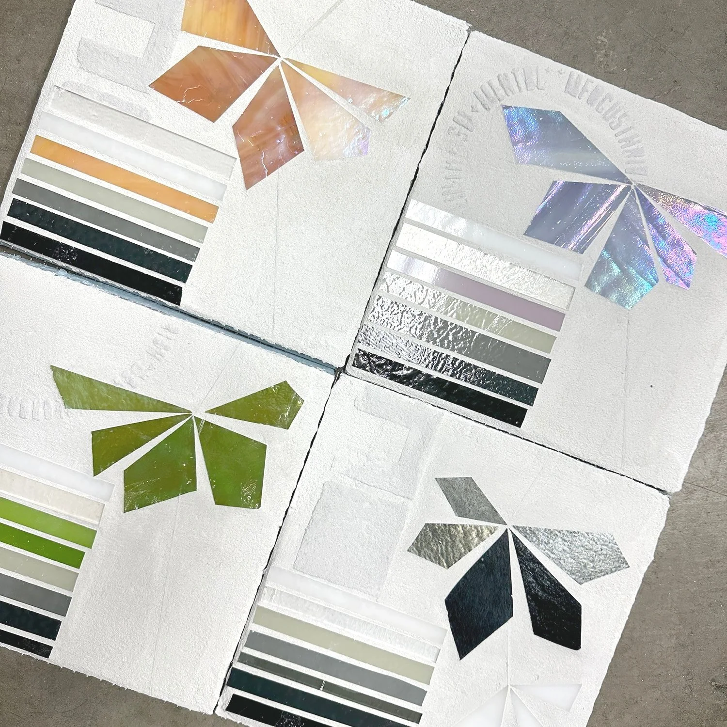
I have color commitment issues when it comes to glass. Color palettes are limited with big gaps in hue and saturation. Some of my favorite glass can vary widely by dyelot. The wispy glass patterns feel busy. Iridescence adds another layer of complexity. It can be spectacular in a piece and add so much interest as it is highly reflective. But it generally brings in multiple additional hues on top of the base color.

At some point I shifted to primarily grayscale glass, partly because supply chain issues over the past 5 years have significantly reduced reliability of glass supply, and partly because black, white and grays are highly consistent colors. Finding the right contrasts (interactions with background concrete) has been a simplified. Bringing color in with paint was a recent strategy with the ENCODE series.

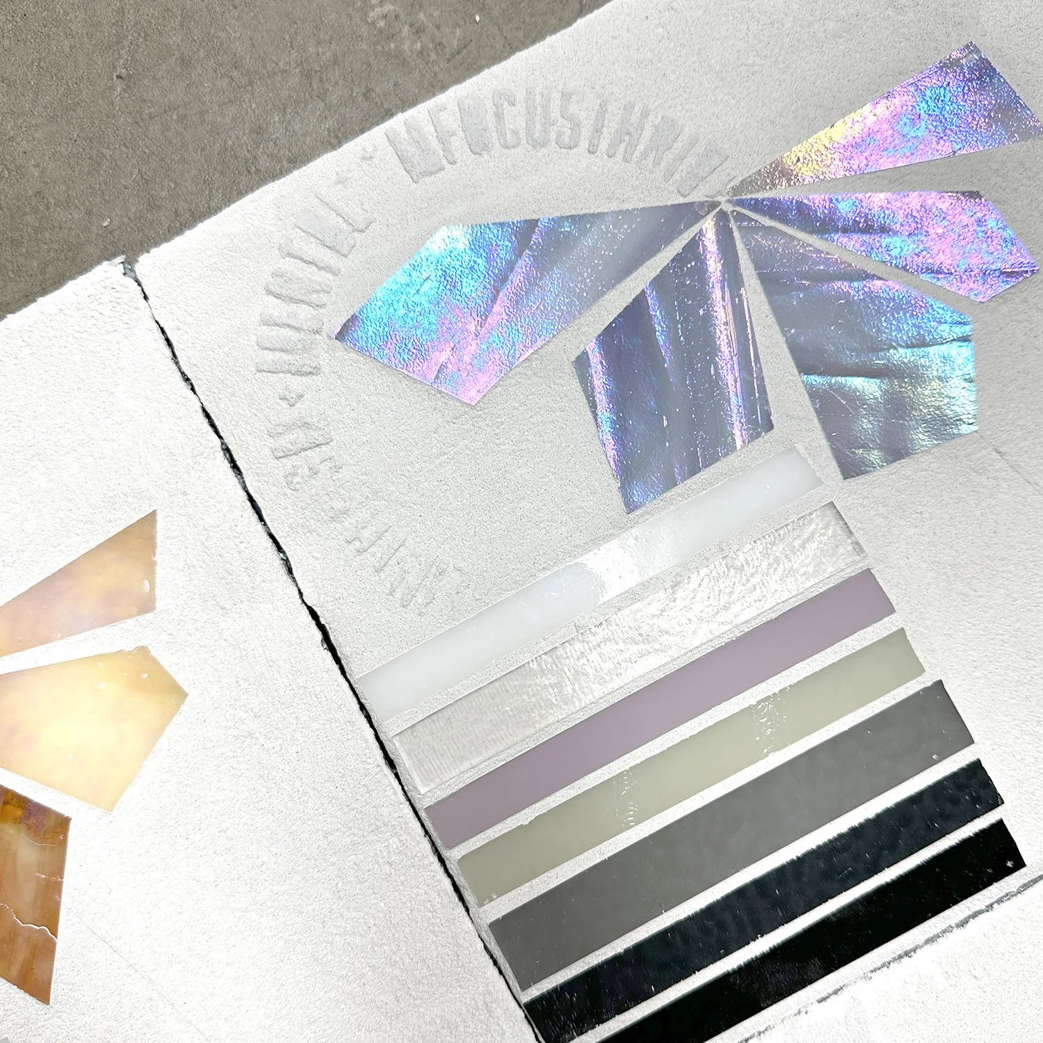
I have been focusing on natural imagery recently and exploring limited color glass accents alongside grayscale palettes. As I move toward using white backgrounds, I am relying on glass palettes to see how glass and background will interact. These give me quick and rough preview of how elements could interact. Of course, I really love the grayscale one. : )

Prev / Next

Newsletter

Thank you!

Instagram

Commissioned for a financial services client in NYC’s Financial District, this triptych blends skyline geometry with shimmering black glass and a pop of foliage. A precise but organic rendering of the river’s reflection.
.
VISTA Steel Lig
A 3-panel commission for an elevator lobby in a historic adaptive reuse development in Denver. Inspired by the iconic Evans School (built 1904 in Classical Revival style by David Dyden), the work layers architectural motifs in amber, gray, and cream&
A stairwell installation designed to shimmer as people pass—layers of green and blue glass suggest ‘digital rain,’ with content and rhythm tailored to the client’s business. Abstract but with encoded meaning, this 3-panel work

Latest Posts

New
New VISTA: Desert Geometries
about 4 days ago
Installation in New Jersey: Greens + blues for a Healing Space
about a week ago
Case study feature | reception area
about a month ago
From Studio to Skyline: New Work Headed to Hudson Yards
about 2 months ago